How to create dashboards in Looker Studio in 2026: step-by-step
Luis Pereira
Founder & CEO at Reporting Ninja
Key takeaways
To create dashboards in Looker Studio step by step, connect your data first, confirm your key metrics, then build KPIs, trend charts, breakdown tables, and filters in a clean layout.
Plan the dashboard before designing: define the main questions, pick the right audience view, and choose chart types that match decisions.
Keep dashboards actionable by showing comparisons (vs last period), highlighting trends, and using tables for fast drilldowns.
If you want faster, repeatable reporting, use automation tools like Reporting Ninja to keep dashboards updated and client-ready.
Building dashboards in Looker Studio can feel fiddly when your charts won’t line up and your metrics don’t match. This guide shows you how to create dashboards in Looker Studio step by step, from connecting data to building charts, adding filters, and sharing a clean, decision-ready report.
Why Looker dashboards matter
Dashboards in Looker Studio turn scattered numbers into clear, visual insights you can actually act on. Instead of digging through spreadsheets or disconnected reports, you get one place to track performance, spot trends, and share results with your team. That transparency makes faster, more confident decision-making much easier.
If you're new to using Looker Studio for marketing reports, this framework will help you avoid the most common setup mistakes.
Strategic reporting vs operational reporting (key differences)
Strategic reporting focuses on long-term trends and high-level KPIs that guide big decisions, like growth or budget planning. Operational reporting is more day-to-day, tracking real-time performance such as campaign results, sales activity, or workload. A strong Looker Studio dashboard can support both views in one place.
Step 1: Laying the foundation – data connection and preparation
Most dashboard issues start here. If your data sources are inconsistent, your KPIs won’t match and your charts will look “wrong” even when Looker Studio is working fine.
Access Looker Studio and create a new report
Sign into your Google account
Open Looker Studio
Click Create → Report to start a blank dashboard
Pro Tip:Name the report now if you’ll reuse it (for example: “Marketing performance dashboard – master”).
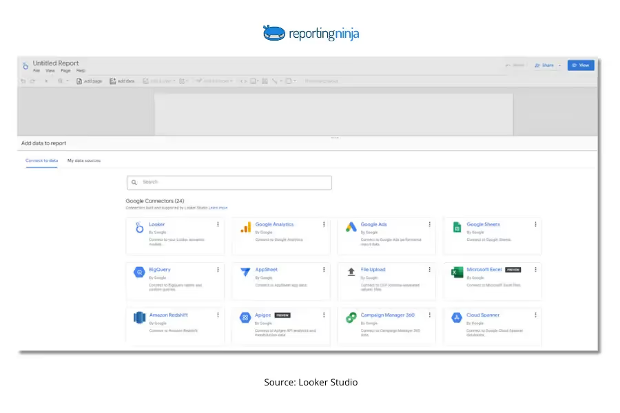
Connect your data sources
Click Add data
Pick a connector (common: GA4, Google Ads, Google Sheets, BigQuery)
Authorize access
Select the property/account/table you need
Click Add to report
Metric selection tip: If you’re connecting multiple platforms, align definitions early. “Conversions” in GA4 and “conversions” in Google Ads often refer to different things unless you’ve matched conversion actions.
Select the right dataset (avoid the “wrong view” problem)
Before you hit Add, sanity-check:
You’re in the right account/property (especially for GA4 and ad platforms)
The date range looks complete (not missing recent days/weeks)
Key fields you’ll need are available (campaign, source/medium, conversions, revenue)
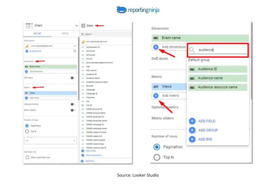
Explore your fields (dimensions vs metrics)
A quick rule that keeps dashboards cleaner:
Dimensions = how you slice (date, channel, campaign, landing page, country)
Metrics = what you measure (sessions, clicks, spend, conversions, revenue)
Metric selection tips that prevent reporting confusion:
Don’t mix users and sessions as if they’re interchangeable
Choose one primary date field and stick to it across charts
Don’t assume “revenue” means the same thing across tools (gross vs net vs tracked purchase revenue)
Clean and transform data (optional, but often worth doing)
Looker Studio can handle light cleanup, but it’s not a full data modelling tool.
In Looker Studio (quick fixes):
Create calculated fields (CTR, CVR, ROAS, CPL)
Rename confusing fields so stakeholders understand them
Use CASE statements to group messy values (for example: channel grouping)
Outside Looker Studio (better for structural cleanup):
Use Google Sheets for mapping tables and quick QA
Use BigQuery for reliable joins, transformations, and larger datasets
Here’s a simple mapping table you can keep in Google Sheets (and connect as a source) to standardize naming across platforms:
Platform
Raw field/value
Dashboard label
Why it matters
GA4
session source/medium
source/medium
Keeps acquisition reporting consistent
Google Ads
campaign
campaign
Aligns naming across paid channels
Meta Ads
campaign name
campaign
Reduces duplicate campaign rows
Any
conversion event/action
conversions
Forces one clear definition
Blend data (only when you truly need one combined view)
Blending is useful, but it’s where dashboards break most often.
Blend when:
You need one chart that combines sources (ad spend + GA4 conversions)
You have a clean join key (date, campaign, landing page)
You can answer the question with separate charts or pages
Quick Rule:If you can’t describe your join key clearly, fix your naming first.
By the end of Step 1, you should have at least one reliable data source connected, your core fields confirmed, and a clear plan for any cleanup or blending you’ll need later.
Step 2: Crafting the blueprint – dashboard planning
This is the step that stops your dashboard turning into a “chart collage.” You’re deciding what the dashboard is for, who it’s for, and what questions it must answer.
Define clear objectives
Start with the decisions the dashboard should support. A good objective is specific and measurable, not “track performance.”
Ask yourself:
What questions should this dashboard answer in 30 seconds?
What does the viewer need to do next based on what they see?
Are you tracking progress vs a target, spotting trends, or comparing segments?
Pro tip:Keep one primary goal per page. If you mix acquisition, conversion, and revenue on one page, you usually end up with a dashboard that’s hard to scan.
Identify your target audience
The same dataset can be “right,” but the dashboard can still fail if it’s built for the wrong reader.
Executives: high-level KPIs, trends, and targets (what’s up/down and why it matters)
Marketers: campaign/channel breakdowns, conversion efficiency, and testing insights
Sales teams: lead volume, pipeline movement, and revenue outcomes
Metric selection tip: match the KPI to the role. For example, CTR is useful for marketers, but it rarely helps an exec decide anything unless it’s tied to spend and conversions.
Choose the right visualizations
Pick the chart type based on the question you’re answering (not based on what looks nice).
Use this quick guide:
Scorecards: headline KPIs (revenue, spend, leads, ROAS) with comparison to prior period
Line charts: trends over time (daily/weekly performance)
Bar charts: compare categories (channels, campaigns, regions)
Tables: detail views (top campaigns, landing pages, keywords) with sorting
Geo maps: only when location changes decisions (territories, regions, store performance)
Pie charts: use sparingly (they’re hard to compare once you have more than a few segments)
Breakdown views where users need to sort/filter quickly
Design an intuitive layout
Your layout should guide the reader from “what happened” to “why” to “what to do next.”
A simple structure that works well:
Top row: KPI scorecards (with period comparison)
Middle: trend charts (what’s changing over time)
Bottom: diagnostic detail (tables or bar charts for drivers)
Pro tip:Group related charts (for example: spend + conversions + CPA together) so users don’t have to “mentally join” charts across the page.
Step 3: Bringing your vision to life – dashboard design in Looker Studio
Now you’re turning the plan into something people can actually use. The goal isn’t “pretty.” It’s clarity, consistency, and dashboards that stay readable when someone glances for five seconds.
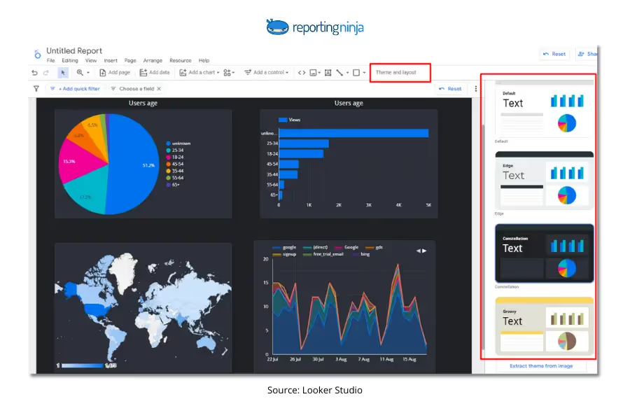
Choose a theme (and lock in consistent styling)
open theme and layout
choose a theme as a baseline, then adjust fonts and colors if needed
keep styling consistent across pages (same font sizes, same chart spacing, same KPI styles)
Pro tip:Pick one font style and two to three core colors max. Over-styling makes dashboards harder to scan.
Set up the page layout before adding charts
This saves time later.
set your canvas size (commonly 16:9 for screens)
turn on grid / snap options so charts align cleanly
decide your section structure (KPIs → trends → breakdowns) before you start dropping charts in
Pro tip:Leave more whitespace than you think you need. Dense dashboards feel “busy,” even when the charts are correct.
Add shapes and dividers to create visual sections
Use design elements to guide the eye, not decorate.
rectangles for section backgrounds (KPI row, trend section, breakdown section)
lines for subtle separation between areas
icons only if they add meaning (for example: a filter icon near controls)
Rule of thumb: if a shape doesn’t clarify structure, remove it.
Write clear titles that say what the chart means
Avoid vague chart titles like “Performance” or “Overview.” Use titles that make the insight obvious.
Better title patterns:
“Leads by channel (last 30 days)”
“Spend vs conversions over time”
“Top campaigns by CPA”
Pro Tip:If a chart needs a long explanation to be understood, it’s usually the wrong chart or it needs a clearer dimension/metric choice.
Step 4: Unveiling insights – building charts and visualizations
This is where your dashboard becomes useful. Focus on charts that answer real questions, not charts that simply display data.
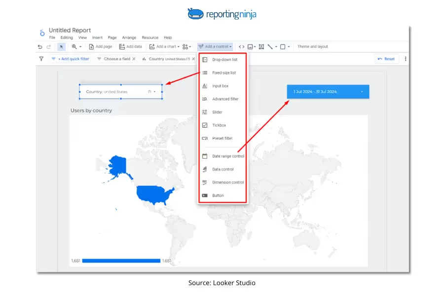
Add interactive filters (so users can explore)
Filters help viewers drill into what matters without editing the report.
Common controls to add:
date range filter (almost always essential)
campaign or channel filter (for marketing dashboards)
region, product, or segment filter (for broader reporting)
Pro Tip:Keep filters at the top of the page so users don’t have to hunt for them.
Create KPI scorecards first
Start with the metrics that define success.
Good KPI examples:
total leads
cost per lead (CPL)
revenue
return on ad spend (ROAS)
conversion rate
Metric selection tip: include context. A KPI without comparison is just a number. Add:
line charts to show trends (are results improving or dropping?)
bar charts to compare channels or campaigns
tables for detailed drilldowns (top landing pages, best ads, highest-cost segments)
Where tables add the most value:
“Top 10 campaigns by spend and conversions”
“Landing pages with highest drop-off”
“Keywords driving qualified leads”
Quick Rule:Every chart should either explain a KPI change or help someone take action.
Customize for readability
Small tweaks make dashboards far easier to use:
sort charts logically (highest to lowest)
limit decimals (nobody needs 4 decimal places)
label axes clearly
avoid cluttered legends or too many segments in one chart
The best dashboards feel simple, even when the data behind them isn’t.
Step 5: Polishing the gem – finalizing your dashboard
At this stage, your dashboard is built. Now you’re making sure it’s clean, accurate, and easy for others to use without explanation.
Refine the layout and spacing
Take a final scan of the page:
are charts aligned cleanly?
are sections visually separated?
is the most important information at the top?
Pro Tip:If the dashboard feels crowded, remove one chart before shrinking everything to fit.
Test every interactive element
Before sharing, click through the dashboard like a real user:
do filters update charts correctly?
do date controls apply across the full page?
do tables sort properly?
are any charts showing “null” or unexpected gaps?
Even small filter issues can break trust in the numbers.
Check metric consistency
This is a quick but important QA step:
do totals match the source platform?
are conversions defined the same way across charts?
are blended data charts behaving as expected?
If something looks off, it’s usually a field definition or join issue, not the chart itself.
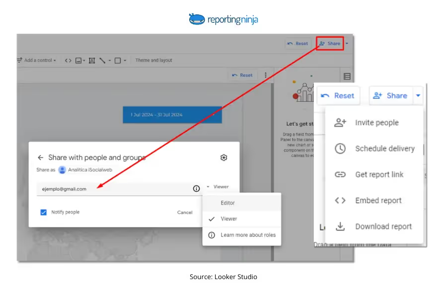
Share or embed your dashboard
Looker Studio makes sharing straightforward:
share via link with view-only or edit access
embed dashboards in internal portals or client reporting hubs
schedule delivery through connected reporting workflows
Pro Tip:Always double-check permissions, especially when using Google Sheets or Ads data sources, since access can break for viewers without the right credentials.
Once shared, your dashboard becomes a living report — something stakeholders can return to anytime for clear, decision-ready insights.
{{cta-block-v1}}
Example of Looker dashboards
Seeing real dashboards makes the process click faster. Below are a few common Looker Studio layouts, with a simple “before vs after” shift from messy charts to clear reporting.
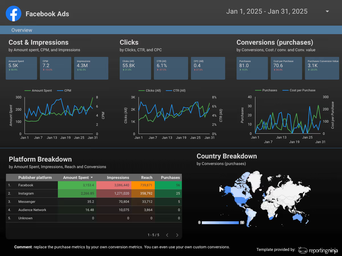
Facebook Ads performance dashboard
Use this when you need a clean view of spend and results without exporting reports every week.
Before: multiple Ads Manager screens and inconsistent filters.
After: one Looker Studio page with KPI scorecards (spend, leads, CPL, ROAS), a daily trend chart, and a top campaigns table.
Ecommerce revenue dashboard
This dashboard focuses on revenue drivers: total sales, conversion rate, average order value, and top products.
Before: spreadsheets and manual weekly updates.
After: an always-live report with product and channel performance in one place.
Sales dashboards work best when they connect lead volume to outcomes, not just activity.
Before: separate CRM exports and marketing reports.
After: a single pipeline view showing lead sources, deal stages, and revenue impact.
Tools & automation to enhance your dashboards
Once your Looker Studio dashboard is live, the next step is making it easier to maintain, automate, and share (especially if you’re reporting across multiple clients or platforms.)
At this stage, some teams also compare Looker Studio vs Looker Studio Pro to decide whether the built-in collaboration features are enough.
Agencies and freelancers who want hands-off Looker Studio reporting
Supermetrics
Large connector library, data pulls into Looker Studio and Sheets, flexible integrations
Higher-cost plans
Enterprises with complex multi-platform reporting needs
Funnel.io
Marketing data hub with strong normalization and transformation options
Premium pricing
Teams needing advanced data modelling before visualization
Reporting Ninja
Reporting Ninja is built for marketers and agencies who want Looker Studio dashboards that don’t require constant manual upkeep. Instead of exporting spreadsheets or rebuilding reports every month, you can connect your ad and analytics data directly, automate refreshes, and deliver consistent client-ready dashboards.
It’s especially useful when you’re managing multiple data sources, recurring performance reports, or stakeholder-facing dashboards that need to stay accurate over time.
With scheduled reporting and reusable templates, Reporting Ninja helps turn Looker Studio into a scalable reporting system, not just a one-off dashboard tool.
{{cta-block-v1}}
Supermetrics
Supermetrics is a well-known connector platform with a wide range of integrations. It’s a solid choice if you need access to many niche data sources, although pricing can become expensive as you scale dashboards across clients or teams.
Funnel.io
Funnel.io is a full marketing data platform designed for teams that need heavy data transformation and normalization before building dashboards. It’s powerful, but often best suited to larger organizations with more complex reporting pipelines.
If you’re researching Looker Studio alternatives, the right choice usually depends on how much data transformation, automation, or enterprise-level governance your team requires. For many agencies, the challenge isn’t visualization - it’s managing connectors, refreshes, and client-ready delivery at scale.
Tips for actionable dashboards
A good Looker Studio dashboard doesn’t just show data; it helps users make decisions quickly. Keep these best practices in mind:
Lead with trends, not static numbers (a KPI is more useful with week-over-week context)
Highlight what changed and why, using clear comparison charts
Keep each page focused on one reporting goal (acquisition, conversions, revenue, etc.)
Use tables for quick drilldowns, like top campaigns or highest-cost segments
Limit chart clutter (fewer visuals with clearer takeaways work better)
Add filters clients actually use (date range, channel, campaign), not dozens of dropdowns
Design for sharing: clean spacing, clear titles, and stakeholder-friendly metric names
Create reporting dashboards in minutes with Reporting Ninja
Looker Studio is powerful, but building dashboards is much easier when your data is already clean, connected, and automated.
Reporting Ninja helps you streamline the entire workflow — from pulling marketing data into Looker Studio to delivering client-ready reports without constant manual updates.
If you want faster reporting, more consistent dashboards, and less time spent exporting spreadsheets, it’s a simple way to scale your reporting process. Start your free trial today.
{{cta-block-v1}}
FAQs
How often should Looker dashboards be updated?
Usually, daily or weekly. Update frequency depends on how fast your metrics change and how often decisions are made.
Can I integrate other tools with Looker dashboards?
Yes. Looker Studio connects to tools like GA4, Google Ads, Sheets, BigQuery, and third-party connectors for more sources.
Can dashboards in Looker be shared with clients?
Yes. You can share view-only links, embed dashboards, or control access permissions for client-facing reporting.
Elevate your marketing reports to the next level
Sign up for a 15 days free trial. No credit card required.
By clicking “Accept”, you agree to the storing of cookies on your device to enhance site navigation, analyze site usage, and assist in our marketing efforts. View our Privacy Policy for more information.