Analytics
May 5, 2026
Best 4 data visualization tools (2026): Top picks for marketers


Picking the right data visualization tool is harder than it looks. Most platforms claim to do everything, but the difference between a tool that saves your team hours each week and one that adds to the workload often comes down to fit.
This guide breaks down the four strongest data visualization tools for marketers and agencies in 2026: Reporting Ninja, Looker Studio, Tableau, and Power BI. Each suits a different workflow. We compare features, pricing, and real-world fit so you can choose the right data visualization software faster.
The best data visualization solutions do more than display polished charts; they help marketers turn scattered data into reports that are clear, useful, and easy to act on. Here's what drove our rankings:
{{cta-block-v1}}
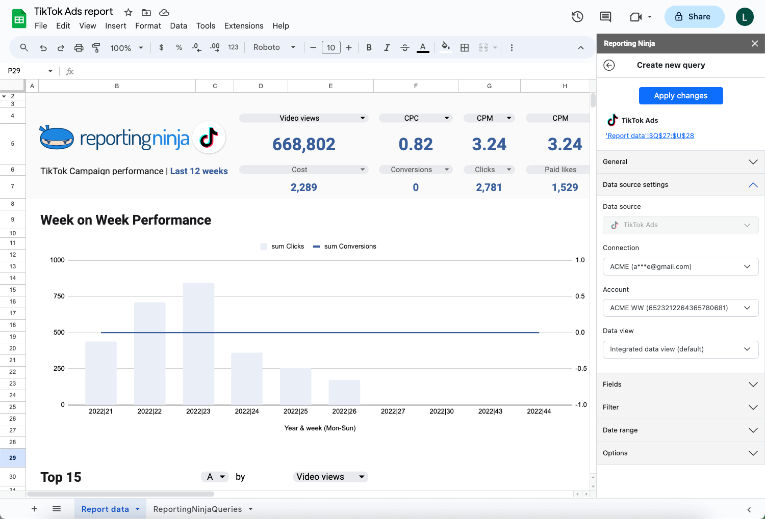
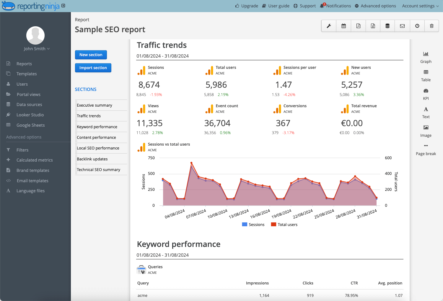
Reporting Ninja is built for marketers and agencies that need to automate recurring reports across SEO, PPC, social, and other channels. What sets it apart from most data visualization tools is flexibility: it offers its own reporting platform plus Looker Studio connectors and a Google Sheets add-on, giving teams more than one way to build and deliver reports without stitching together separate products.
Reporting Ninja’s strongest features are the ones that reduce reporting friction while still giving marketers flexibility in how they present data.
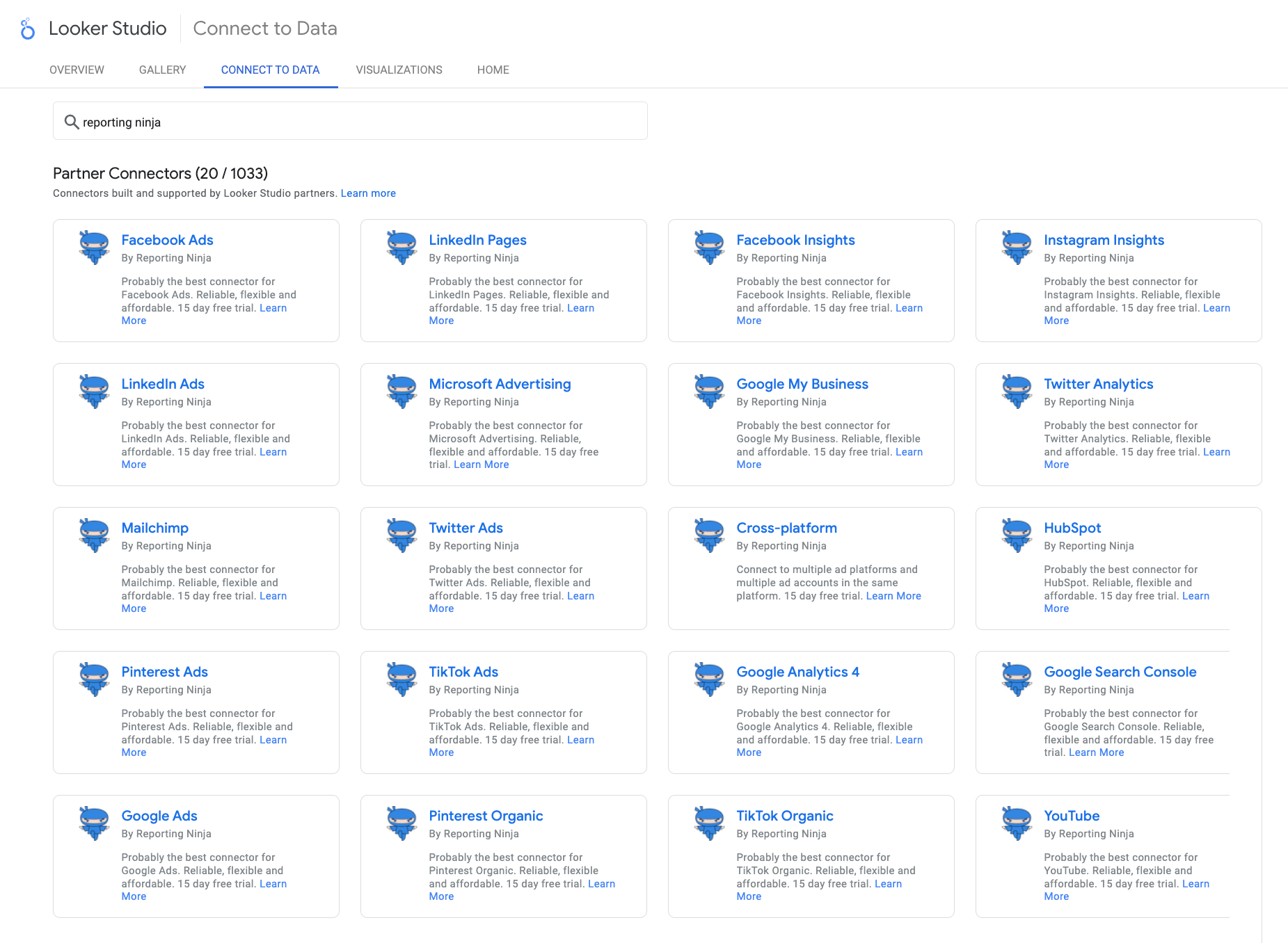
A lot of tools force you into a single reporting environment. Reporting Ninja is more flexible than that. It supports its own built-in reporting platform, plus Looker Studio connectors and a Google Sheets add-on, which gives marketers several ways to work depending on the client, team, or use case.
That matters because reporting needs are rarely identical across every account. One client may want clean, scheduled dashboards. Another may still rely on spreadsheet workflows. Another may prefer custom Looker Studio builds. Reporting Ninja covers those use cases without forcing teams to stitch together separate reporting products.
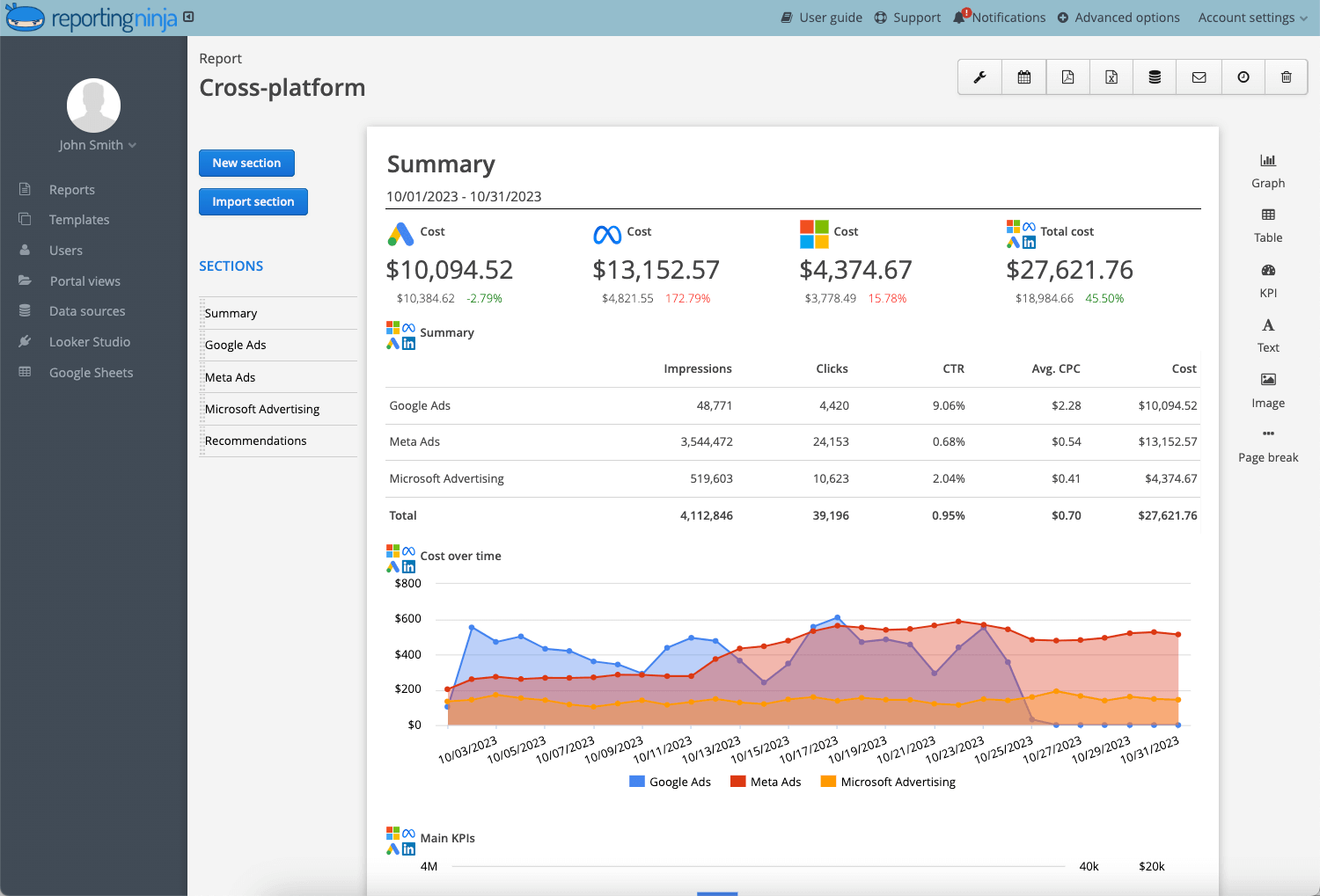
Reporting Ninja is especially useful when reporting goes beyond a single channel. Instead of treating SEO, PPC, and social as separate reporting tasks, it helps teams bring performance into one clearer view. That makes it easier to show combined campaign impact and reduce the manual effort that often comes with cross-platform reporting.
For marketers managing multiple channels, this is a practical advantage. You aren’t just building prettier charts. You are making reporting more consistent, easier to deliver, and more useful for clients or internal stakeholders who want a broader performance picture.
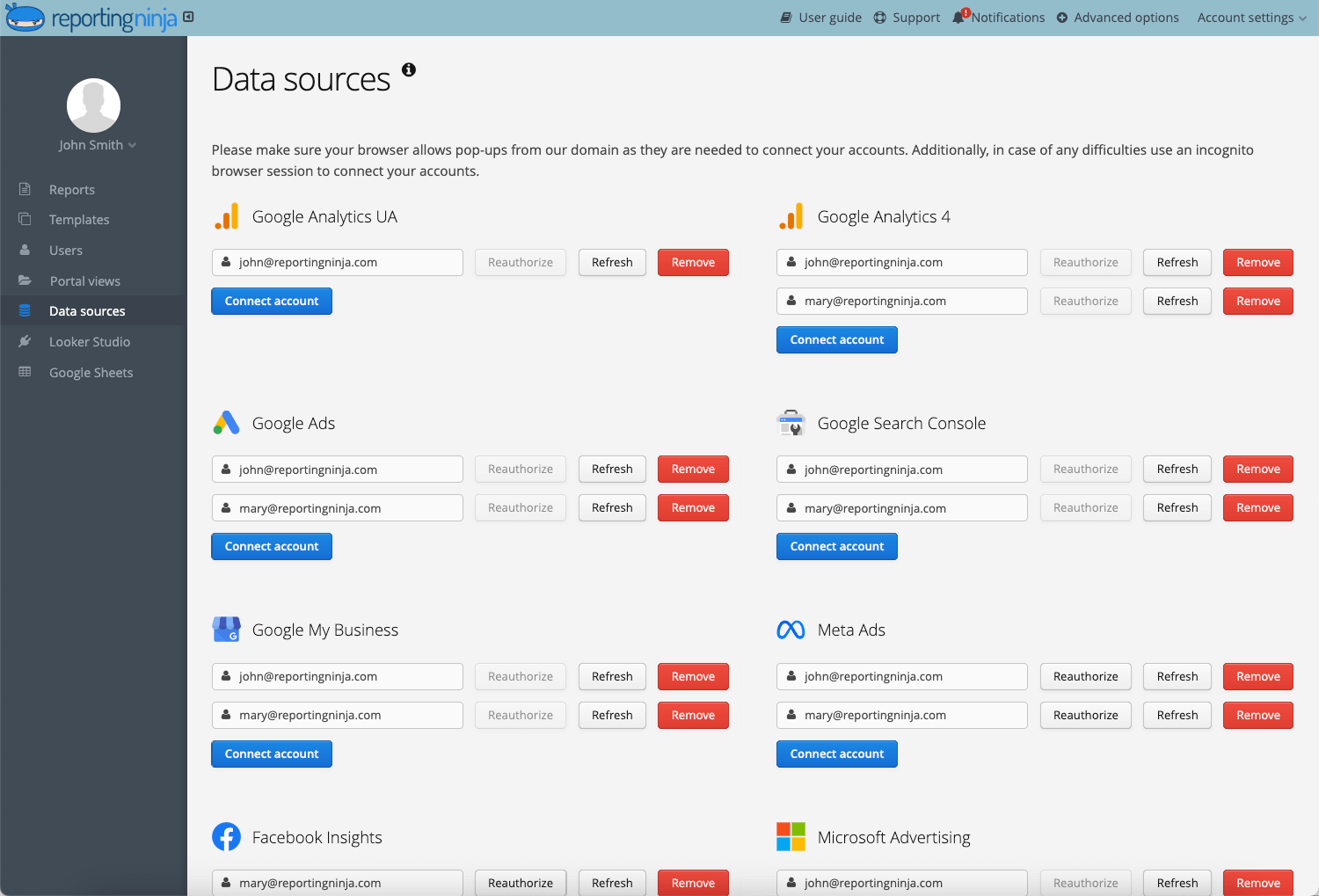
One of Reporting Ninja’s biggest strengths is that it helps teams standardize recurring reporting. That is especially important for agencies handling multiple accounts, where reporting quality can slip if every dashboard is built differently or updated manually.
A more repeatable workflow means less time pulling numbers, fewer reporting errors, and more consistency across accounts. It also makes reporting easier to scale as client volume grows.
Instead of rebuilding the same deliverables every cycle, teams can focus more on interpretation and recommendations.
“I had already worked with other tools, but the balance between automation, customization, and the visuals offered by Reporting Ninja meets all my needs. The ability to integrate data from various marketing channels and turn them into such well-crafted reports saves us a lot of time while enhancing our clients' experience.” Stephanie Barbieri, Studio 33
“As the leader of a marketing team, we used to spend hours immersed in spreadsheets and gathering data. Thanks to Reporting Ninja, we've transformed that process. Automation has freed up my team, allowing us to focus on what truly matters: crafting effective strategies.” Daniel Kristoffersen, Fox Real Estate
Ready to streamline your reporting? Reporting Ninja gives agencies and marketers a faster, more scalable way to deliver client-ready reports. Start your free trial.
{{cta-block-v1}}
Google Data Studio (formerly Looker Studio) is a strong fit for teams that want more control over how they visualize and share performance data, without committing to a dedicated reporting platform from day one. It gives marketers a flexible workspace for turning data into dashboards, but the value depends heavily on how much time your team can spend building, testing, and maintaining those reports.
Data Studio gives users control over report layouts, charts, filters, images, text, and multi-page dashboards. Its drag-and-drop editor is built to make report creation accessible, while still giving teams enough customization to tailor reports for specific campaigns, clients, or internal stakeholders.
Data Studio connects directly to more than 1,400 data sources, including Google Sheets, Google Ads, BigQuery, and Google Analytics. Google also notes that teams can use Community Connectors for other databases and applications, or build their own connector when needed.
Reports can be shared with individuals or groups, embedded on websites or intranets, and used for real-time collaboration. This makes Data Studio useful when teams want live reporting access rather than static exports.
Data Studio’s core product is free, which makes it attractive for teams that want self-service data visualizations and reports. Costs can increase if you need Data Studio Pro, paid third-party connectors, or internal setup and maintenance.
“What I like best about Looker Studio is how it helps me track my business data effectively in one single place. Working in business management, I deal with a lot of different data points and revenue tracking daily. Looker Studio makes it easy to pull all that information together so I’m not jumping between different spreadsheets.” Baalji M, verified user on G2.
“Looker Studio can feel limited when it comes to more advanced data modelling and complex calculations. Performance may slow down with larger datasets, and some connectors can be unreliable or end up requiring workarounds. Customisation beyond the basic visualisations also feels somewhat restrictive, especially compared with more advanced BI tools.” Candy N, verified user on G2.
Tableau is a strong fit for teams that need deeper analysis and more advanced visual reporting than most marketing tools provide. You can build interactive dashboards, explore data from multiple angles, and uncover patterns that simpler reporting platforms can miss.
Tableau allows users to build highly interactive dashboards with strong filtering, drill-down, and exploration capabilities. This gives teams more control over how they analyze trends and present layered reporting views.
It offers a wide range of charting and visual design options, which helps teams create more detailed and customized reporting outputs than simpler dashboard tools usually allow.
Tableau is not limited to marketing reporting. It is often used across departments, which makes it useful for organizations that want one platform for broader data analysis and executive reporting.
“The drag-and-drop feature and AI-enabled analysis are the aspects that add the most value to Tableau by helping me generate dashboards from large amounts of data in a few minutes. Two years' worth of daily experience in using the tool with live data integration from different sources have streamlined my work process significantly.” Vijaysingh, verified user on G2.
“It becomes quite limited once you need to implement multiple datasets, especially when the datasets have a huge volume behind it. The dashboards are also limited compared to other BI oriented software.” John D, verified user on G2.
Power BI is a solid choice for teams that want deeper reporting without moving to a heavier BI platform straight away. It is especially strong for organizations already embedded in the Microsoft ecosystem (Teams, SharePoint, Excel, Azure), where data access, dashboard sharing, and adoption are more straightforward.
Power BI works especially well for organizations already using Microsoft tools. That can make data access, dashboard sharing, and broader reporting adoption more straightforward for internal teams.
It supports interactive dashboards, layered reporting, and deeper data analysis than lighter marketing reporting tools. That makes it useful for teams that want more flexibility than a simple dashboard builder can provide.
Power BI is often a good fit for growing companies that need reporting to serve multiple departments, stakeholders, or business units. It can support marketing dashboards, but it also has value far beyond marketing alone.
“The seamless integration with other Microsoft tools like Excel, Teams, and Azure makes Power BI incredibly convenient. The drag-and-drop interface allows non-technical users to build powerful dashboards quickly, while the DAX formula language gives analysts deep customization. Real-time data refresh and the ability to share reports across an organization without extra licensing costs are major advantages.” Archala R, verified user on G2.
“When reports start getting bigger with many visuals, performance can sometimes slow down a bit. It usually works fine but you need to design the model carefully if the dataset grows. Also, learning DAX properly takes some time. Basic reports are easy, but advanced calculations definitely require practice.” Ritik J, verified user on G2.
The right data visualization tool depends less on which platform has the most features and more on which one fits your reporting workflow. Some teams need fast, repeatable client reporting. Others need custom dashboards or deeper analysis. These are the features worth prioritizing first.
A good platform should match how your team actually works. Some tools only support one style of dashboarding, while others give you several ways to build, customize, and deliver reports. That matters when one client wants a live dashboard, another prefers a spreadsheet view, and an internal team needs a cleaner executive summary.
Reporting Ninja handles this well by supporting its own reporting platform, Looker Studio connectors, and a Google Sheets add-on, giving marketers more flexibility than a single-format reporting tool.
{{cta-block-v1}}
It is easy to focus on how a dashboard looks on day one and ignore how much work it takes to maintain. That becomes a bigger issue as reporting expands across more clients, campaigns, and channels. A tool that looks affordable at first can become costly if every update requires manual fixes.
The strongest setups reduce time spent pulling data, cleaning reports, and rebuilding the same views each month. Reporting Ninja is built around recurring reporting workflows, which helps agencies and marketers keep delivery more consistent without relying so heavily on manual upkeep.
The right data visualization tool depends on who needs to read the report. Analysts may want deeper exploration, while marketers, clients, and executives usually need a faster view of performance. If the platform does not match the audience, dashboards can become too complex to use.
If you need client-ready marketing reports, clarity and presentation matter more than heavy BI depth. Reporting Ninja is a robust data visualization solution for teams seeking clearer marketing reporting without unnecessary complexity.
{{cta-block-v1}}
For marketers and agencies, the right data visualization tool means faster reporting, cleaner dashboards, and less manual work every cycle. Reporting Ninja delivers all three—with its own platform, Looker Studio connectors, and Google Sheets support built in.
Start your free trial today.
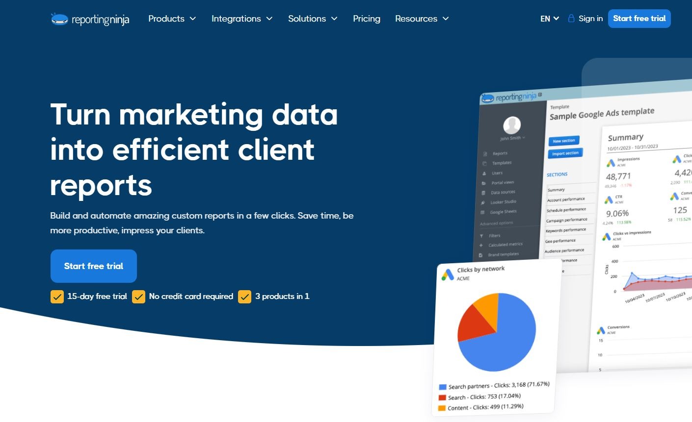
Sign up for a 15 days free trial. No credit card required.

Build and automate amazing custom reports in a few clicks. Save time, be more productive, impress your clients.